

Our Responsive Web Design service ensures that your website looks and functions flawlessly on all devices, including desktops, tablets, and smartphones. We create adaptive layouts, seamless navigation, and visually appealing designs that provide an optimal user experience. By focusing on responsivenes s, we help businesses engage visitors, reduce bounce rates, and improve conversions across every screen size. Responsive Web Design

Discover how our expert team can create websites that adapt seamlessly to any device, providing a smooth and engaging user experience. Connect with us to explore responsive design solutions that enhance usability, boost engagement, and drive conversions.


Mobile-First Website Design
Create designs that prioritize mobile users for faster, smoother browsing on all devices.
Get a Quote
Discover Portfolio

Responsive Layout Development
Build flexible layouts that automatically adjust to different screen sizes and resolutions.
Get a Quote
Discover Portfolio

Cross-Browser Compatibility Optimization
Ensure your website looks perfect and functions consistently on all major browsers.
Get a Quote
Discover Portfolio

Responsive UI/UX Enhancements
Improve navigation, spacing, and interactions for a seamless multi-device experience.
Get a Quote
Discover Portfolio

Speed & Performance Optimization
Optimize images, code, and structure to ensure fast loading on phones, tablets, and desktops.
Get a Quote
Discover Portfolio

Responsive Testing & Troubleshooting
Test and fix layout issues across devices to guarantee a flawless responsive design.
Get a Quote
Discover Portfolio
Essential Productivity
Toolbox


Custom Mobile App Development/h3>
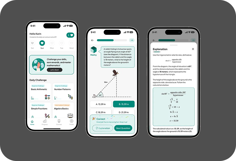
Math Calculation
Math doesn’t have to be intimidating. Our Math Calculation App makes solving equations and understanding concepts easy and interactive. From basic arithmetic to advanced functions, it offers instant, step-by-step solutions in a clean, user-friendly interface. This case study showcases how we designed a smart, reliable tool that turns complex problems into simple solutions anytime, anywhere.
Frequently Asked Questions
Have questions? We’re here to help.
What is responsive web design?
Responsive web design ensures that a website adapts seamlessly to different screen sizes and devices, providing an optimal user experience.
Why is responsive design important?
Responsive web design ensures that a website adapts seamlessly to different screen sizes and devices, providing an optimal user experience.
Will my website look good on all devices?
Responsive web design ensures that a website adapts seamlessly to different screen sizes and devices, providing an optimal user experience.
Does responsive design affect website speed?
Responsive web design ensures that a website adapts seamlessly to different screen sizes and devices, providing an optimal user experience.
Testimonials
What Our Customer Saying

Working with this team was a game-changer. They completely redesigned our web app with a modern UI and seamless UX. The performance, speed, and responsiveness improved drastically. We’ve received great feedback from our users since the launch.

Jhone Wick
Satisfy Customer
Our organic traffic has doubled in the past 3 months thanks to their SEO expertise. They optimized our website structure, improved keyword targeting, and fixed core vitals. We now rank on the first page for several competitive terms.
Alex
Satisfy Customer
MADSOLS turned our app idea into reality with speed and precision. The user experience is so smooth that our customers keep coming back. They truly understand what makes an app successful.
Emily Carter
Satisfy Customer
Let’s Dicuss Your Project
Let’s discuss your project and turn your ideas into reality. Whether you’re starting from scratch or scaling something big, we’re here to design, develop, and deliver digital solutions that make an impact. Share your vision — we’ll help bring it to life with clarity and creativity.


